Looker studio is an open source tool by Google to create your dashboards and communicate your findings via interactive visualizations. Even though it has a wide range of visualization options to choose from, there are still times when we want to present data in a unique way or want an additional feature in the available charts. After what seems to be an entire era of relying on Looker Studio’s available charts to display our work, we can finally make our own Custom Visualizations.
The new Custom Visualization Feature
This upcoming feature in looker studio is in private beta and will allow users to create their desired visualization, embed it into their reports and share them with others! The only drawback that I consider here is that to create these visualizations, you need to have at least beginner level knowledge of coding languages like HTML, CSS and javascript. You can also use javascript libraries in your visualizations (For example; d3.js) but the source needs to be in the main source of the visualization. External references to the libraries will not work.
A guide to make and use a custom visualization is available in this codelab.
These Custom Visualizations are a one-time investment. You can make one and reuse it as many times as you want in different looker studio reports. Awesome, right? But I am not done yet. You can also publish your custom visualizations to the Looker Studio Community by following these steps. A few featured visualizations by The Looker Studio Community can be found here.
What we did
We at MarketLytics, love to experiment and couldn’t hold back when we heard of this awesome feature being introduced by Looker Studio. Here are some of our favorite custom-built visualizations in d3.js for the Looker Studio Community!
Conversion Funnel
Link: gs://lookerstudio-visualization/conversion-funnel
One of the most important insights for decision makers is to know the performance of the funnel that leads to user conversion. In addition to that, they also need to know what are the pain points of their conversion funnel where users drop. For Example, if the checkout page on your ecommerce site takes a lot of time to load, or the available payment options are inconvenient and the user leaves before making a purchase.
Google Analytics offer such insights via it’s Goal Flow and Funnel Visualization report. We thought it’d be useful to have a graphical representation of a Conversion Funnel in Looker Studio.
This conversion funnel represents each step of your goal as a bar. And the shaded area above each bar is the drop off rate of the user from the previous step. You can also get the respective numbers by hovering over the bars. Try it out here.

Data Requirement: Each step of the funnel needs to be a Goal or a calculated metric.

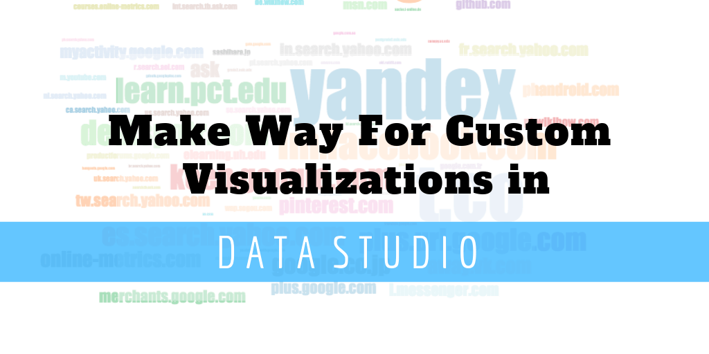
Word Cloud
Link: gs://lookerstudio-visualization/word-cloud
From my days of academia, I have been obsessed with Word Clouds. A word cloud is a graphical representation of the frequency with which a particular text appears in your data. It is very simple, yet appealing to the eye. You get the required information right away without digging too much into the visualization.
Word Clouds can be used for most of the visualizations which consist of text. For Example;
-
A Word Cloud of popular search keywords of your website.
-
Top sources of the users on your website
-
Representing most used words/hashtags in your content website.
-
Getting your most popular campaigns
-
Exploratory Data Analysis for your NLP problem
We made a word cloud of popular sources by sessions using the Google Merchandise Store Data. It is built on d3.js getting the top 250 popular sources. You can explore the word cloud in this report.
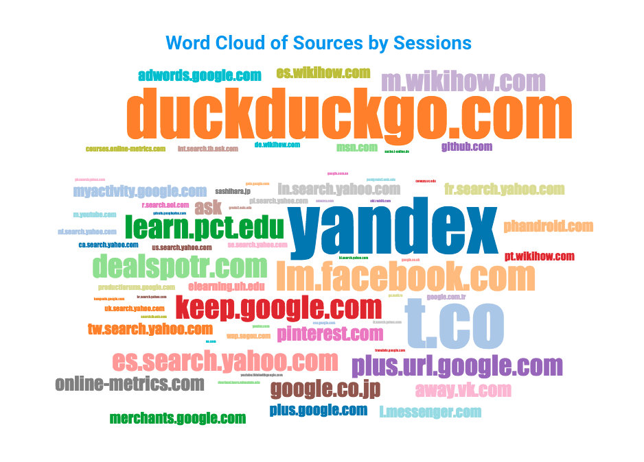
Data Requirement: This graph takes a dimension preferably text which contains text and a metric to measure the frequency of the dimension.
Histograms with Customized Binning
Link: gs://datastudio-visualization/Buckets
A histogram is a quick way to get information of a data distribution. It is one of the most common graphs to visualize your numeric data. They give information about the skewness, distribution and outliers which are very useful when it comes to Data Analysis. Being this useful and common, it is still not available yet in Looker Studio. But hey, we can also make one on our own! Here is our histogram of sessions.
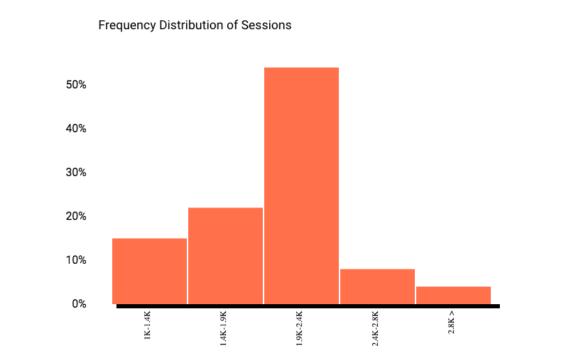
This histogram lets you visualize the frequency distribution of a metric. The configuration of bin width is usually intuitive so we decided to add an additional feature to our histogram which lets you increase or decrease the size of your bin by the style panel of the chart.
Data Requirements: Add your required variable to measure frequency distribution as a metric for this graph and a dimension against which the metric will be distributed. You need to also enter a bucket size. By default it will be 1000 per bucket.
Note: To try out the custom bin width feature you need to make a Looker Studio report and add the visualization link in your Community Visualization preview.
Cohort Analysis for User Retention
Link: gs://lookerstudio-visualization/user-retention
Our most recent visualization for Looker Studio Community is the Cohort Analysis Graph for User Retention. This is the most common type of User Retention which is known as Day-N Retention.
Day-N Retention lets you visualize the percentage of your users who come back the next day to your website. Using this visualization you can compare your data with respect to previous days.
For example, you can see if your customers are sticking up after subscribing or any repeated user behavior.
We needed a simple 7-Day User Retention Graph which can be viewed here. You can also make one for your Monthly or Weekly Data (like in Google Analytics; Home Report showing real time data).
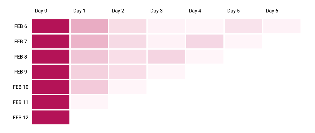
Data Requirement: This graph takes first dimension as data and second as a Client or User ID. You can use Users , Sessions or any other metric according to your requirements.
If you want to try out the above visualizations you can follow this guide and use the link mentioned with each visualization. Don’t forget to turn on the Community Visualization access on the Data Source in your report and the owner’s credentials.